

27 January . 2020
Color of the Year choices are feeling the blues
Each year, paint companies and color experts announce their choices for Color of the Year, to help consumers select from an overwhelming number of colors available and choose palettes that feel fresh, updated and relevant to today’s times.
Some years, the Colors of the Year vary widely from company to company. For 2020, there’s a clear consensus: blue is in, and it’s a reflection of how we feel right now.
“When you look at a highly anxious, contentious world right now, people feel unsettled, unmoored almost,” said Dee Schlotter, senior color manager for the paint brand PPG. “Blue is a trustworthy, anchoring color. It’s the color of the sea and sky, and it’s just really reassuring.”
PPG’s Color of the Year, Chinese Porcelain, is a blend of deep cobalt and moody, inky blue. PPG says the color “imparts calmness and restful sleep while also offering the spirit of hopefulness – a rare commodity in a restless world.”
Schlotter said blues such as Chinese Porcelain make it easy for consumers to turn away from stark grays, which are on their way out, and embrace colors that delight the senses.
“Blue is the easiest possible entry point from the world of neutrals to the world of color,” she said. “Chinese Porcelain delivers the energy and brightness of cobalt blue, a trending hue taking the automotive, consumer electronics and fashion industry by storm. It also incorporates the enveloping of a deep, muted navy tone that is popular in residential and hospitality design.”
Pantone’s Classic Blue
Perhaps the most influential Color of the Year comes from Pantone, whose color matching system is used in industries ranging from fashion and product design, to graphic design and manufacturing.
For 2020, Pantone is also going with blue – Classic Blue to be exact. Suggestive of the sky at dusk, Classic Blue is a reassuring color, highlighting our desire for a dependable and stable foundation as we cross the threshold into a new era, the company says.
Blue hues have been long associated with peace, calm, and the dependable daylight sky. They feel solid and reliable, offering constancy and comfort, according to Pantone.
“Classic Blue is a reassuring presence, instilling calm, confidence, and connection,” said Laurie Pressman, vice president at the Pantone Color Institute. “While technology races ahead, often overwhelming our human ability to process everything around us, it’s only natural that we gravitate toward colors that bring a sense of peace, clarity, and even protection.
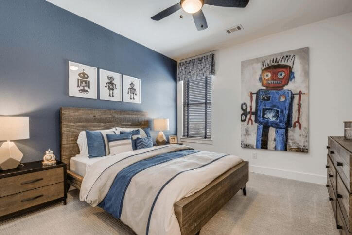
Naval from Sherwin-Williams
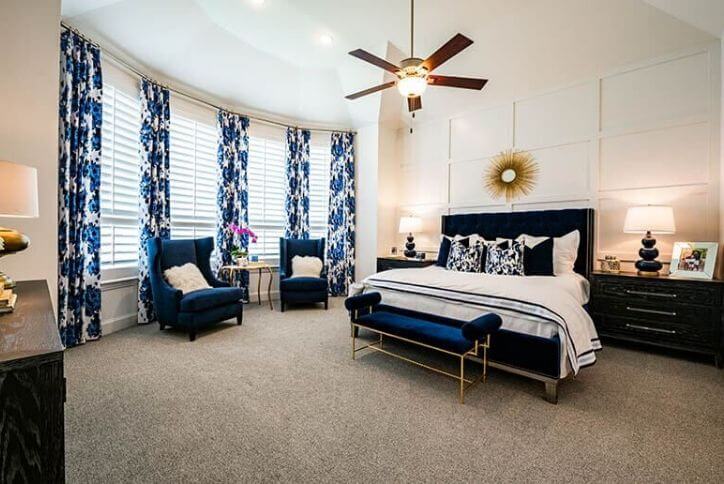
Yet another blue hue, Naval, is the Color of the Year from paint giant Sherwin-Williams.
This rich navy creates a calm and grounding environment infused with quiet confidence. It evokes a prominent sense of confidence that fuses timeless color with a fresh mix of natural materials and textures that bring navy blue into a new era.
Naval fuses the bold opulence of Art Deco style with the awe‑inspiring power of nature – from the infinite night sky to the mysterious depths of the sea. This updates a navy as a time-honored color and brings it out of its comfort zone, ushering in an empowering new year and fresh decade of change.
Getting Back to Nature
Some companies went beyond blue for their Color of the Year choices.
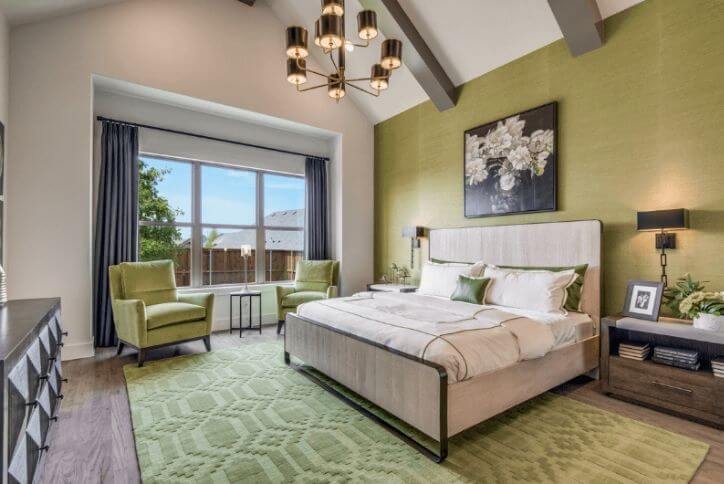
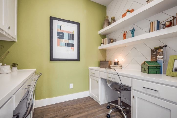
Also inspired by the natural world, Behr’s 2020 Color of the Year is a tranquil light green called Back to Nature.
Behr describes this revitalizing color as "calm, gracious, and balanced," and a way to bring the outside in and reengage with the great outdoors.
"Getting out there in nature also is known to have a huge, positive impact on our health and wellbeing," said Behr’s Erika Woelfel, vice president of color and creative services. "It also has been shown to improve creativity, boost memory, improve your problem-solving skills."
She described Back to Nature as "a restorative, subtle, effortless, meadow-inspired hue," a color that engages the senses and pairs well with other colors both inside and outside the home.
The delicacy of First Light
Taking a completely different direction for its Color of the Year, Benjamin Moore & Co. selected a warm, rosy pink named First Light.
The first pink hue ever chosen by the company, it symbolizes an upbeat and hopeful start to the next ten years.
“Today’s changing technology, environmental concerns, and cultural and economic influences are all shaping how we live,” said Hannah Yeo, color and design manager for Benjamin Moore. “More than ever, we expect the home to provide security, comfort, community, self-expression, and optimism. So we said, what are some of the colors that would really help with that?”
Etsy says Chartreuse
It’s not just paint companies that have announced their Colors of the Year for 2020. Etsy has also gotten into the color trend game, naming the vibrant yellow-green shade of Chartreuse as its color for 2020.
A stark contrast from Etsy’s 2019 selection of burnt orange, chartreuse is a bold color known for increasing energy, encouraging unconventional thinking, and evoking feelings of growth and harmony.
Etsy said it has already seen its shoppers jump on the green bandwagon, with a 12% increase in searches for green items on its website in late 2019. For neon green items, searches jumped 55%.
Etsy’s resident trend expert, Dayna Isom Johnson, said chartreuse fits in with the company’s declaration of 2020 as the “Year of Purpose.”
“It’s all about making mindful choices and thinking about the impact of our actions, including our purchases,” Isom Johnson said. “With a new decade on the horizon, 2020 will be a year for new beginnings and making meaningful change, and the trends we’re predicting—like chartreuse, which connects us with nature and evokes feelings of growth and focus to make thoughtful decisions—perfectly complement that sentiment.”
Tour fresh colors
To see how homebuilders are incorporating trending colors into their designs, tour the fully furnished model homes at The Grove Frisco, featuring fresh designs from our best-in-class builders. Before you tour, stop by our information center at Orchard House to learn more about our award-winning community.